When it comes to choosing our favorite coffee places, a purist may not be primarily interested in such things as interior design or a nice looking coffee bag. Yet nobody would argue, it is not only outstanding coffee, but also the atmosphere that plays a crucial role in how we perceive each shop.
Of all the local specialty coffee spots that I regularly visit only a few manage to apply their high-quality approach to coffee beverages to other main aspects of their business, for instance to corporate design and hospitality alike. It is delivered with consistency at Rachid El Ofairi’s Frankfurt based coffee bar Aniis. That is why I spoke with interior designer and light architect Stefan Riemer, corporate designer Kai Staudacher, barista and coffee shop consultant Paul Bonna, and Rachid El Ofairi about how they found the perfect style for Aniis.
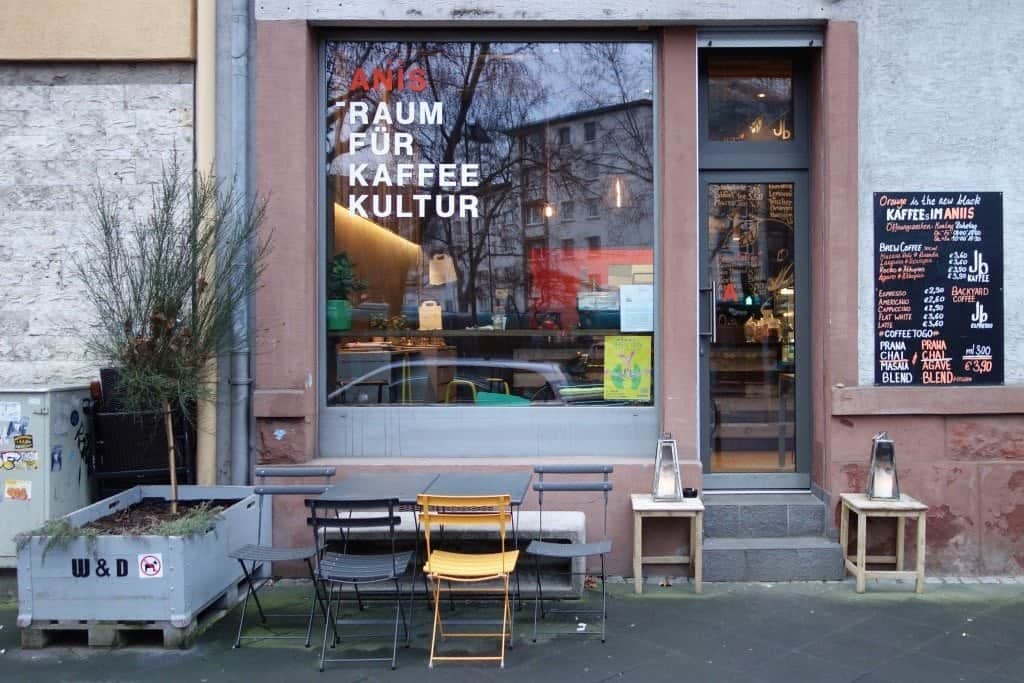
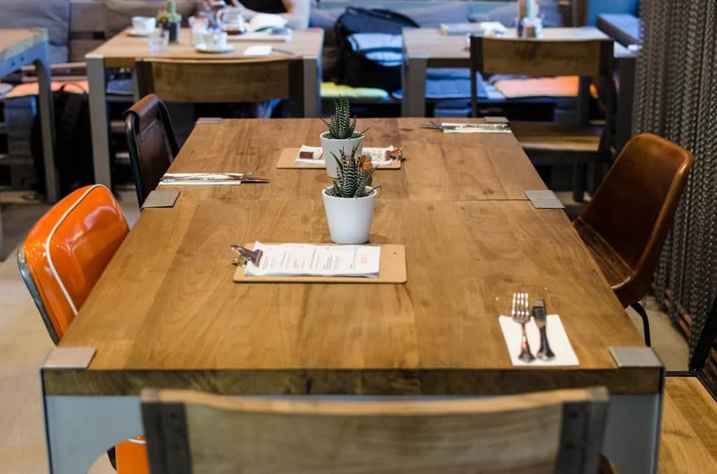
For one and a half year he played around with different ideas, Rachid tells me, leading towards the final concept of Aniis. His main inspiration came from coffee shops in Oslo and Berlin as well as several pinterest profiles. He was settled on one thing: he prefered a mixture of calm orange and warm grey colours. In the end the café gained a smooth mixture of Retro and Vintage Chic and incorporated several industrial elements.
The bar and its workflow were planned by Paul Bonna of Kaffeekommune, Mainz. Paul says, given the special shape of the room, the challenge was to link the espresso section with the brew bar and the kitchen. He planned for Aniis to have two main customer areas. The first one, in front of the counter and left of the entrance, is for take-away coffees. The second one is in the back of the café and to the right of the entrance, where there is space to sit in with your coffee.
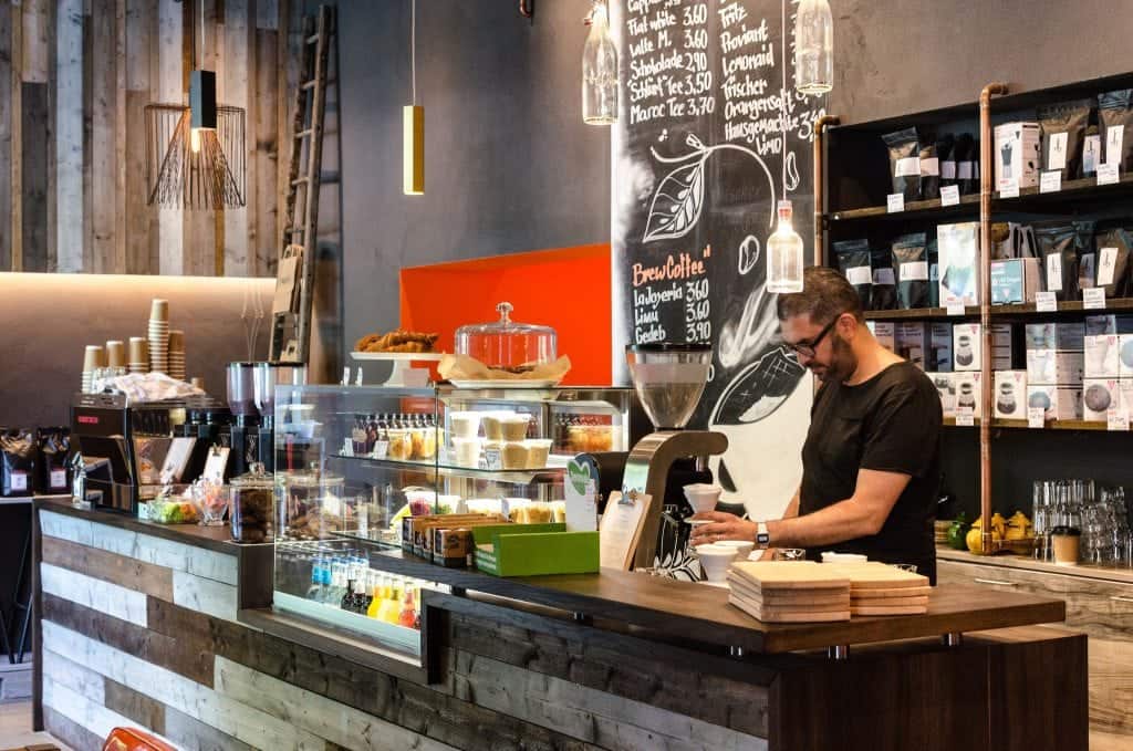
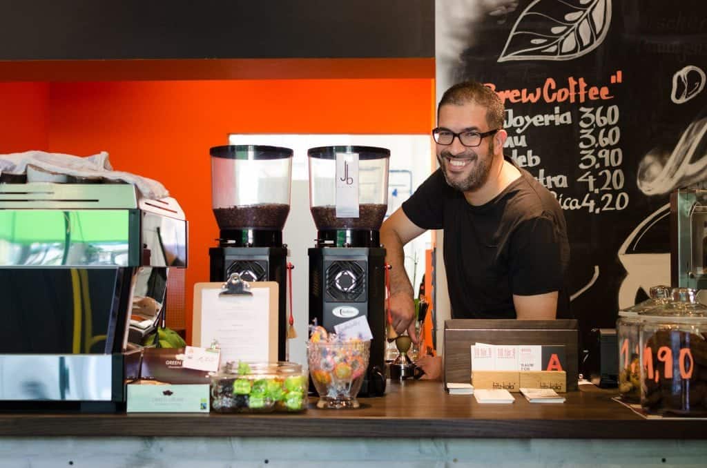
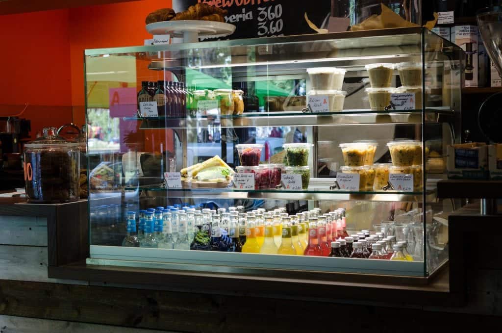
Consequently, they put the espresso section and take away section on the left of the bar, with a drink and food showcase in the middle, placing the brew bar on the right. He explains that he prefers the bar opened. It is about implementing transparency – a major concern in specialty coffee – on the design level. The bar at Aniis is reducing the barrier with the customer and makes communication easier.
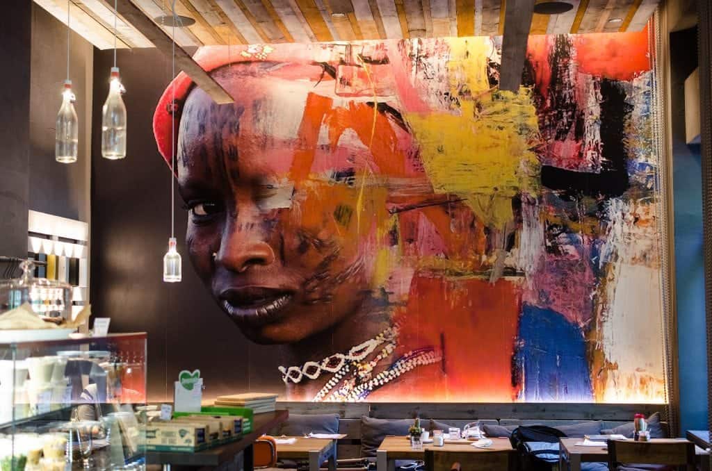
It was Stefan Riemer’s main objective to create a welcoming atmosphere through the use of suitable lights. Stefan wanted the visitor to feel comfortable as he enters the place. Aniis was also perfected through intense teamwork, he explains. Although they did a lot of conceptual work beforehand, there was a more intuitive hands-on construction work on-site. “It is important that there is something people remember once they’ve been to a certain location,” he explains, “which was achieved by the vast picture on the wall” – a photograph by artist Antonio Mora.

Although people tend to be more sensitized to design issues, as Kai Staudacher puts it, to work with an actual designer may help to grasp an overall picture instead of just displaying a collection of “beautiful” things. He points out that it was great to start working together at an early point of the design process – and that their collaboration still goes on.
Kai and his staff members have established to visit Aniis for lunch once a week and Kai also came here with a corporate design class he taught. Although Rachid’s roots are in Morocco, Kai admits that the first mood boards they created had too much of an ethno-chic. Nonetheless, this bond was well preserved in the look and the taste of his cafe. Besides a Moroccan cuisine-influenced menu the Steelite’s craft series dishes have the look of handmade earthenware that you would expect to find in Northern African suqs.
In the restrooms of the cafe the simple patterns of black and white tiles make for a beautiful mosaic. The name Aniis is a reference to the traditional Moroccan spice – yet there is a secondary translation to the word, too, meaning “friend” or “companion”. As Kai reveals, Rachid wished for a coffee-less logo, something that would not be an obvious sign of a cafe – no beans or the likes.
They came up with a capital A and chose a font that Kai calls “leicht verratzt”, which means it has a worn out style. This perfectly underlines the look of the café.